A2 Media Studies Advanced Portfolio
Ester Dios Vidal
Click ALL the titles in the menu bar.
Analysis of two digipaks
Front cover:
The front cover is very colourful and interesting. The idea behind the graphics of the front cover was to be able communicate Tim ‘Avicci’ himself, but at the same time reflecting the creativity that is constantly going on in his mind. This is why his album contains combining genre songs which are reflected through the variety of colours in the face and borders of the front cover design. Their idea was to create a powerful idea for the main cover which could attract the targeted audience while at the same time it can communicate the genre. In addition, the front album also has Avicci’s logo and the name of the album clearly written in a big font. I believe this is an effective way to captivate a younger audience attention.

Back cover:
The back cover of the album ‘Stories’ is simple and straightforward. It includes a barcode, the list of all 14 songs and credits to the record companies. Once again it has the colourful pattern around the edges of the album, thereby communicating the mix of genre and songs it includes. All the text of the song is in white making it stand out from the dark night background. The font size in which the list of songs are written are quite small and they are situated to the left of the back cover, leaving a fairly large black space.
x (Ed Sheeran album)
X (pronounced "multiply") is the second studio album by English singer-songwriter, Ed Sheeran.
Ed Sheeran explains why he names his albums math symbols: “I was like, 'I don't really want to be a poster boy. ' So I figured out a way with colors & symbols. I'd love to get to a point that there's a billboard of just red with an equals sign & people go 'Ed's got a new album'.”
Front cover:
The front album cover of any digipak should have a distinctive and easy to recognise image of the band or artist. At the front of an album cover, the name of the album or band should be featured.
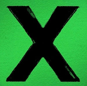
The colour of this Ed Sheeran album cover is very distinctive. Instead of making reference to the genre of the songs in the album, he has used a strategic way to attract the targeted audience. The intense green and giant X, has a reason behind it. In his previous album, released in 2011, the front cover design was a huge + sign. This is a clever choice of designs which will catch the attention of audiences. There is no text and therefore no font. In fact, it is simple and straightforward as there is simply one sign and nothing more.

Back cover:
The back album cover should contain an image related to the front cover. The barcode, website link, record label and logo as well as the track list, together with numbers which indicate what track it is.
The back cover of Ed Sheeran’s second studio album is very similar to the front cover in terms of the colour. It is related in a way as it has the same black background with the name of the album, ‘x’, in green. These are a clever use of colours as they clearly stand out and are easy to distinguish. The layout is effective as we can clearly see all aspects such as the barcode, name of the artist, name of the album and list of songs very clearly. The songs included in the album are listed and easy to read. Aswell, the use of this design help to attract a young audience and communicate in a certain way the genre of the songs.
Stories (Avicii album)
‘Stories’ is the second album by the Swedish Avicci, released on the 2 October 2015 by PRMD Music and Island Records. The album combines many genres like Dance/Electronic, Pop, Soul and many more. It includes songs such as “Trouble”, “Waiting for Love” and many more.


The inside part is once again connected to the front and back cover. The of the disco ‘x’ is repeated continuously and therefore easy to identify. The disco itself is plain black and has no drawing or important text written. Overall, the choice of Ed sheeran od this design is intelligent and effective. All what has to be shown is included and it can catch the targeted audience’s attention easily. Also, the choice of colours, font and layout is curious but effective. Most of his songs are pop and R&B/Soul and although there is no element which clearly tells us this, it is still a good choice of digipak.

Inside the digipak there is a little booklet next to the cd which contains what Avicii has done during the years and his achievements. The cd is completely black and it contains the logo and name of the album in the font as front cover. It clearly links with the forms and conventions of the album as although the cd is black, the background where it is placed is full of the colours seen in both the front and back cover.